
Title
Originally, my title ideas stemmed from the character's name since she was the main focus of the film, and her name foreshadows the film's central theme, based on Maya Angelou's poem. Therefore, some of my early ideas were "Catching Rose", "The Life of Rose", "A Life of Rose" and "Rose: Robust, Optimistic, Strong, Energetic".
However, I felt that these didn't capture the whole essence of the film since they were vague about the plot.
The title of a piece is important since it can grab the audience's attention, thus the best titles are centred around the film's central theme or original character, and must fit the film's story (Miyamoto, 2017).
Yet, some titles can also have dual meanings, and be relevant to several elements of the film's narrative (Miyamoto, 2017).
This is what I aimed to do with my film's title, therefore, I decided on "AGAIN". This captures the theme of the film since it is focused on finding positive ways to overcome fear, even if that means trying several times, but is also hints at the plot.
My character, Rose, has to start her paper again at the end of the film, after going through several repetitive actions, even repeating her own past. However, the end of the film shows her positive attitude towards this, and her failing grade implies she can gain a better mark if she tries again. By trying again, she has everything to gain.
Character
Characters are arguably the most vital element to a story, since they act as the point of identification for the audience, helping them become emotionally invested in the story. For this reason, characters need to have attributes which can be seen as "human", in order for the audience to be able to relate to and understand them (Black, 2017).
For example, the defining attribute of a character should be their motivation, that is how they deal with the obstacles in the story, and how they let these shape and change them as the narrative progresses (Grace, 2015).
Therefore, the creation of characters is basically "a writer's grasp of what a human being is", depending on how the writer sees the world, and how they choose for the character to see the world of the story (Miller, 2011).
Rosemary "Rose" Keen

For the main character of this film I decided to take the little girl who is the narrator of the poem "Life Doesn't Frighten Me", but show her dealing with growing up and the new challenges this brings, such as with school work.
I decided to name her Rose, since the narrator of "Life Doesn't Frighten Me" has a positive outlook and convinces herself she is not afraid, which reminded me of the phrase "looking through rose-coloured glasses", since this can mean that someone has a view of the world which is too optimistic or too sentimental (The Free Dictionary, s.d). I wanted this to act as the foundation for Rose since, as the older version of the poem's narrator, she could have grown up being more and more positive, but now finds she has to view things more realistically, therefore giving up a little of her optimism, but not all of it.
I deiced on the surname Keen, since it derives from the old English word for "bold" and "brave" (Behind The Name, 2011). This is because I wanted Rose to be in control of her own story, therefore having her own "agency", and being able to be brave herself to overcome her fear and become her own hero.
Hero is a character archetype, meaning that the type of character Rose is fits the attributes for "hero", such as that she is brave, but she has her own view on the world which makes her complex and more believable (Black, 2017).
For example, Rose sees the world through the subject that she takes, which is physics, so when filming I decided to use lots of kinetic shots to emphasise physicality and movement to reflect this (see below). For this reason, Rose's goal is to overcome her fear of the deadline, using her love of physics.
Therefore, it was essential for me to show her character development. This can be done through changing the style as the character becomes younger or older -- many of the shots where Rose is younger are brighter than those when she is older -- or showing a character's beliefs being affected by time and their environment, for example, using a location to make a character realise they have an inner strength which is yet to be uncovered (Now Novel, s.d).


For this reason, I decided to use montages to show Rose's progression in physics over the years as her love for it increased, as well as to show her frustration that she can't conquer her fear at the beginning of the film. This allows the audience to experience Rose's struggle with her, and understand her perspective on the obstacle she is facing, thus helping them to relate to and understand her better.
Yet, although Rose is fictional, to make her more real I based certain elements of her personality on myself. I decided to do this, since:
"These similarities give the authors a solid grasp on their characters, and their character a solid anchor in reality"
(Lancet, 2017).
This was helpful since I could add details, such as using the star light to calm down, and scrunching up paper and throwing it when stressed since these were things I did when I studied physics. In addition, this also helped to add detail in the set design (see below).
Casting

Since I knew the film was going to be silent as I aimed to cut montages together using sound, I wanted to find an actress who was able to show a wide range of emotion so that the character's feelings were emphasised, and could be better perceived by the audience.
Therefore, I decided to cast Zuzanna because I knew she could perform with a lot of emotion from the directions unit, and that she was reliable and great to work with.
She also matched the description of the character since she can look younger or older, and was able to bring nuance to the part, letting the audience know what was happening in the character's mind through only expressions, such as shaking her head, or raising an eyebrow.
Locations
Summer house/office set

The main reason I decided to use the summer house for an office set is because it meant I could control the design of the space, and therefore create a space which could reflect the character and her love of physics in a more detailed way than would have been possible if I had used an actual office as an location.
However, I also decided to use the space because it is quite common for authors to have outside rooms such as sheds and summer houses to write in (see fig.1).

Fig. 1 Writer's Spaces (s.d)
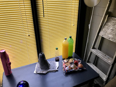
Also, since the character is based on my own experience when studying physics, I thought this would help ground the film in that reality because I used to study in the summer house just like my character. For this reason I already had the furniture needed such as the desk, tables and cabinets, which just needed to be dressed to look more like a study space for a physics student:


Compared to:


By doing a location recce, I found that there was enough space (with the furniture cleared) to set up equipment and film, especially since the cast and crew were few. The ceiling also worked with the projector light so I knew I could get those shots, and there was already a clock hung on the wall.
However, the floor was slightly uneven in places, so I was unsure we would be able to get steady tracking shots using the track and dolly.
To solve this, when filming when decided to keep the rug on the floor, since it was thick so helped even out the boards and steady the track.
From this recce I was also able to make an overhead diagram, which helped when deciding where to place furniture and the equipment so that there would be room to get all the shots I wanted in an economical way.

I also plotted compass plots so that I could tell where the natural light would be coming from and how this would affect how time seems to pass during the film. I found the light could be controlled and kept quite constant by keeping the blinds on the windows closed, however, it still got dark when the sun went down, which was noticeable.
Therefore, this was something I had to think about while scheduling the scenes. For example, we filmed the scene where she leaves with the paper at the end of the shoot, and the one where she gets back with it at the beginning in order for the light to change and the audience be made aware that time had passed in the film.

Groombridge Place

However, since it is the winter only a certain number of attractions were open, so the treetop walkway wasn't available for filming. Also, the other attractions were extremely busy since it is Christmas, so I wasn't able to obtain permission to film here.
The Observatory Science Centre

However, I also wasn't able to obtain permission to film here, since I couldn't afford the fee, however, this is understandable since the centre is a non-profit, educational organisation.
Camera Approach & Influences
Since I started storyboarding early in the pre-production process, most of them show sequences from the first draft of the script. However, these still helped me film the sequences which were in subsequent drafts, since they acted as the base for them in redrafting.

These storyboards also helped me to use influences when directing. The spinning is an example of this, since it is typically used by director Damien Chazelle (Whiplash & First Man). He uses it in a lot of his films, but I was mainly influenced by his use of it during a musical number in La La Land (2016).

Fig. 2 La La Land (2016)
Here, Chazelle uses spinning to disorient the audience (see fig. 2), showing the chaos of the glitz and glamour of Hollywood as people clamour to network at a party in order to find that person who can help them make their name in the industry, highlighting the confusion one of the main characters is feeling at this moment.For this reason, I was inspired to use the spinning to show the audience how Rose's fear builds and builds, in sync with the bubbling and ticking showing how time is against her as panic bubbles inside her.
However, Chazelle's spinning effect moves to the right, but I decided to change it so mine moves to the left. This is because it is anti-clockwise, emphasising how Rose is battling with the clock, since they move in opposite directions.
The shots of the clock are jump cuts, which was inspired by Alfred Hitchcock's Psycho (1960), when he uses shots of the victim's mouth screaming in the shower scene to highlight her fear and emotion for the audience. I experimented with this in my montage workshop film, and decided to use it in this film too because of how I found in the workshop that jump cuts can be used to make something more immediate, helping build the pressure of the clock constantly ticking, and getting faster, allowing me to also speed up the spinning to increase the confusion and panic felt by the character, as Chazelle does with the spinning and confusion in La La Land (2016).
Therefore, the opening sequence of my film is an overtonal montage, since it combines metric montage as is cut to a tempo, rhythmic montage, since cuts are made to this beat, and tonal montage since the visuals convey a sense of tone to the audience through the character's emotions.

Fig. 3 Jackie (2017)
I also aimed to focus on Rose's emotions by using superimposition with the projector light putting stars on her face to show how out of control the spinning gets, and therefore how out of control her emotions become.This was inspired by Jackie (2017), and the shot where the image of the crowd superimposes on her face as her car passes (see fig. 3). It is used to show how she feels about the crowd being there, and implies she feels somewhat indifferent towards them.
I also wanted to show this with Rose, and make it clear to the audience that the light isn't helping her to calm down, like she wants it to, but is actually only making her feel worse.

For these shots, I wanted to make the sequence where Rose walks to her desk more interesting for the audience so they weren't just watching her walk across empty space, but could see details of the space which revealed information about the character.
The inspiration for this came from Star Wars: The Force Awakens (2015), when Rey walks into her home, but instead the audience see close-ups of her belongings, such as the doll of an X-Wing pilot, foreshadowing her dream of becoming one, as well as where the story may take her (see fig.4).

Fig. 4 Star Wars: The Force Awakens (2015)
This specific shot influenced me to include a shot of some model astronauts, since this foreshadows Rose's dream of becoming an astronaut, while also showing the audience she is a physics student once combined with the other shots in the sequence, such as the alarm clock experiment and astronomy posters.

However, I also decided to emphasise this by masking the frame to a 4:3 aspect ratio for the first half of the film.
This was inspired by Homecoming (2018-), where it is used in the flash-forward narrative (see fig.5), until the main character remembers what she had forgotten about her past, allowing the frame to widen.

Fig. 5 Homecoming (2018)
This not only allowed me to show the audience more of what was going on inside the character's mind, but also helped illustrate the change she goes through as the narrative progresses (more below).

This was influenced by my directions unit work researching Sofia Coppola, since this is a shot she commonly uses as her character's reflect and sometimes dream of the outside world (see fig.6).
Fig. 6 Lost in Translation (2003)
However, since a main theme of my film for this unit is fear, I decided to use this shot to show how afraid Rose is of the outside world, showing how far she has to go, especially since going outside will be a step to handing in the paper and conquering her fear of the deadline.For this reason, I decided to not superimpose the outside on her face, as Sofia Coppola does, since I wanted the focus to be on Rose's thoughts and emotions about the world, so the audience see things solely from her perspective.

Therefore, before this sequence I decided to add an effect which doubled the image, in order to show that the character was tired and disoriented, as the effect disorientates the viewer. I experimented with this in my workshop film and liked how it worked, since it can be controlled well using simple keyframes to make it more or less intense.
Although not a nightmare, this sequence was inspired by a scene from Castle (2009-2016) where the protagonists are kidnapped by a mysterious group (see lighting).
However, to emphasise how Rose feels about herself because of her fear, I decided to include labels with negative words on them to show how her fear is from her lack of self belief. This therefore allowed me to contrast this sequence with the end of the film.

However, we came up with solutions for this, such as filming the shots where she is walking as coverage -- filming her leaving the desk, then crossing the room, then going out the door -- which then cut together better than a pan would have during the edit since it made the film more concise as there wasn't as much unnecessary action being shown to the audience.

However, trying this in the workshop didn't work very well, but we found a track in did, even though it didn't have the same effect.


Fig.7 Vertigo (1958)


However, after considering this, I realised that it would take longer than one day to hand in and mark a paper, therefore I reversed these scenes, filming the one where she leaves when it was dark, as if she had been working on the paper all day, and the one where she comes back in the morning, as if several days could have passed, maybe even weeks, while the paper was being graded.
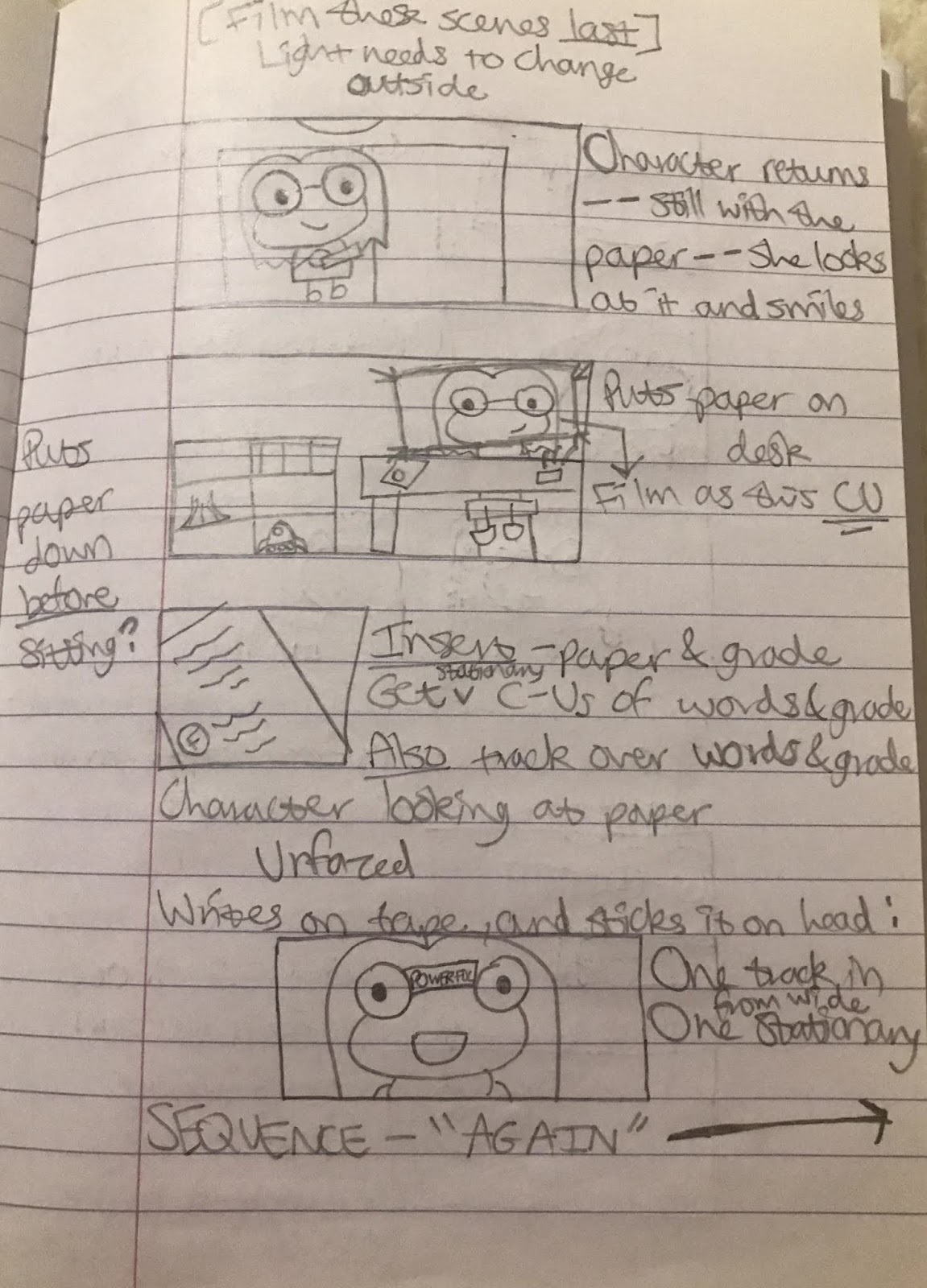


However, the shot where she sticks the label on her head was more effective as the end shot, since it is implied by that action that this sequence would follow, therefore it is unnecessary to repeat these actions again for the audience.


For the new sequence where Rose thinks about her past and the audience revisit it, I decided to use lots of kinetic shots to give the montage an energy which was lively, highlighting her youth and innocence as she is excited about getting started studying the subject she loves.
However, I also decided to bring this into the present narrative by having a shot in this montage where the camera pans from the back of the character, to the side so she is in profile, and then to the front, showing how she is moving forward by going back and remembering her past with physics.
This was inspired by a shot from Alias (2001-2006), where the camera tilts up from the main character's hands to her face, then pans around her so that the other character in the back of the frame can become visible by pulling the focus (see fig 8, 9, 10 & 11).


Therefore, I was inspired to aim for this in my own camera move, since it is an emotional moment for Rose, and one which I want the audience to share with her.
However, I also decided to bring this into the present narrative by having a shot in this montage where the camera pans from the back of the character, to the side so she is in profile, and then to the front, showing how she is moving forward by going back and remembering her past with physics.
This was inspired by a shot from Alias (2001-2006), where the camera tilts up from the main character's hands to her face, then pans around her so that the other character in the back of the frame can become visible by pulling the focus (see fig 8, 9, 10 & 11).


Fig. 8, 9, 10 & 11 Alias (2005)
This allows the tension the main character feels to be captured by the closed position of her hands and the expression on her face, as well as also conveying the concern the other character feels for her by his expression. It makes it seem as if the other character is trying to get a sense of the main character's thoughts and feelings in this moment, as the audience is.Therefore, I was inspired to aim for this in my own camera move, since it is an emotional moment for Rose, and one which I want the audience to share with her.
Production design
Costumes

For costumes I decided to take inspiration from science fiction movies, since I figured that as a science student they would be Rose's favourite type of film. Therefore, I based her costumes on Murph from Interstellar (2014), and Louise from Arrival (2016) -- (see fig. 12, 13, 14 & 15).
Both of these characters are women who are in some way related to science. For example, Murph engineers a new space station, while Louise learns to communicate with an alien race.
For this reason both of these characters do a lot of work inventing new things and experimenting, thus their costumes are practical and casual. This can be seen from how Murph wears an oversized jacket, as if it is borrowed, and Louise wears clothes which don't always match, such as her shirt with a cardigan over the top, as if she dressed quickly.
Murph from Interstellar:

Fig. 12 Interstellar (2014)
Louise from Arrival:

Fig. 13 Arrival (2016)

Fig. 14 Arrival (2016)

Fig. 15 Arrival (2016)
Therefore, for Rose's costume I decided on mainly shirts, jeans and boots, as well as jumpers, which don't always seem to fit her right, and sometimes don't match the location.

For example, she wears her jacket throughout a lot of the film, even though she stays mostly indoors. I decided that this jacket would be the piece of costume which reflected Rose most, since it is covered in patches which show her love for space and ambition to be an astronaut, as well as is red, highlighting her passion.
When designing the costumes I came up with my own colour meanings, since I already researched colour theory in film for the directions unit so I have a basic understanding of how they can affect the audience.
I was inspired to do this by the fact that:
"Color theory norms should be understood by filmmakers, but never seen as a limitation"
(Risk, s.d).
Therefore, I thought it would make the film more interesting and more relevant to how the character was feeling if the colours represented these attributes:- Red = passion, anger
- Blue = stability, calm
- White = innocence, youth
- Pink = love
- Green = growth
- Gray = neutral
- Black = fear
For example, when Rose is younger and starting on one of her first science projects, I decided to dress her in a white jumper to convey to the audience her innocence, highlighted by her excitement and eagerness to get started:

I also dressed her in a lot of blue during this sequence, but dressed her in red at the start, showing how she is most passionate about the subject when just beginning because of her excitement, and calm because she finds the experiments she is doing fun.
However, her jacket is red since I wanted to show how as her passion for physics has developed, her dream has begun to mean more and more to her, therefore she gets angrier and more frustrated when things go wrong in the present, which has led to her fearing the deadline.
Yet, the shirt under the jacket is blue, and so are her jeans through the whole film, symbolising that her dream gives her an inner calm since it is a constant thing so is stable.
Set design
Set design is needed in film since it is a visual medium, so by showing the audience what they need to know, they can interact more with the narrative, using the visuals to infer things about characters in the film, or a scene's mood, or the overall theme of the piece (Renée, 2018).
An example of this is how the audience see close-ups of Rey's belongings as she arrives home in Star Wars: The Force Awakens (2015). As mentioned earlier this influenced me to include this shot of the model astronauts because they imply details about my character, Rose, but also they show the audience that one of the themes of the film is physics:

Props such as the calendar, clock, and volcano also help show the audience the mood of scenes, for example, they help portray the character's panic and fear in the opening sequence. Since they also reoccur in the film, they become motifs for these feelings, motif being defined as "a usually recurring salient thematic element (as in the arts); especially : a dominant idea or central theme" (Merriam-Webster, s.d).

Fig. 16 Homecoming (2018)
I was influenced to think about how props could become motifs in this way by Homecoming (2018-) and its main character's desk (see fig.16). Throughout the series she can be seen arranging the objects strewn across it, keeping them all in the same place and becoming annoyed if someone moves them. This shows viewers her inner thoughts and feelings, and reveals that it is part of her personality to be a perfectionist, thus allowing the audience to get to know her better and be able to predict how she may act in situations.
This is why I used the volcano for example to symbolise my character's panic, because it signals to the audience that when the volcano appears the character will be panicking, as well as foreshadowing that she will panic in situations which involve the deadline.

Sound design
For sound design I mainly concentrated on these motifs, by allowing ticking and bubbling to reoccur, as the character's fear does.
However, I also added music to separate this, and show the journey Rose goes on. For example, although I used the same music for most of the film, it changes slightly when she comes back with the paper because of how her attitude towards her fear has changed. It is softer when she is disappointed, becoming more and more like the music used in the rest of the film as she prepares to repeat writing her paper, as the music repeats when she begins.
I also used sounds from NASA to highlight the physics and space theme of the film. An example of this was the phrase, "Houston, we've had a problem", highlighting that the character has hit an obstacle, but still keeping it relevant to the themes.
However, I decided to change the music and tone of the sounds during and just before the nightmare sequence in order to show the audience the change of tone into something darker and more intense than the rest of the film. For this reason I cut on the music during the nightmare sequence, since the beat is quite jarring, emphasising the harsh pacing of the nightmare as the character isn't sure what's going on.
Lighting
For most of the film I decided to use the technique of realism with lighting. Realism in lighting is similar to natural lighting, but instead of looking as raw as documentary footage the subject is slightly highlighted by the light, yet it is not too obvious to the viewer since the intensity is kept pretty constant over time (Stinson, 2000). I decided on this because I wanted the audience to relate to the character and her story so it needed to feel real to them.
However, for the nightmare sequence I used hard lighting, inspired by Castle (2009-2016) -- (see fig. 17 & 18), since this isn't real, and I wanted to alert the audience to this, making the light jarring, similar to the music, so that it exaggerated Rose's expressions, along with the jump cuts as the framing gets closer.

Fig. 17 Castle (2011)

Fig. 18 Castle (2011)
Editing
Effects tests:
Rotation//Spinning:
This shows that keyframes allow for a smooth rotation in Premiere Pro. However, I did find from this that it can be jolting for viewers if the character is moving too much, which influenced my decision to keep Rose as still as possible during the opening sequence of the film as she spins.
Unmasking the frame (green screen):
From this I was able to discover that the theory of filming the actor with a green screen and the background separate worked to recreate the shot from Homecoming (2018-) when the frame becomes unmasked.
Rough cut:
Feedback
-Make it shorter and more concise; the actions which fill in movement, such as the character turning, can be implied
-Colour grade so the style of the visuals is constant in terms of lighting/colours etc.
-Add sound; some music, but not all the way through, as well as whooshes and other effects to emphasise motion such as the push in on deadline and the mask widening
-Add in effects such as spinning and the ceiling
-Cut the end sequence so that the last shot is Rose with the positive label on her head; the end sequence is already implied by this action
Fine cut:
Feedback
-Add in the star ceiling effect
-Tone down the jacket colour in the first shot of Rose facing the camera in the nightmare sequence
-Match the cuts of the footage to the music in the nightmare sequence
-Extend the double effect before the nightmare so it is less confusing for the audience, and looks more like an effect rather than a technical issue; add a sound such as a slide to also convey this more clearly
-Move the close-up of the rainbow project so the whole camera move in the wide shot is not broken up
-Add in sounds such as the unmasking whoosh and make this shot look less obvious as a green screen by blurring it slightly and softening the edges of the character
-Bring the end music in sooner so that it can take the audience out of the film
List of illustrations
Figure 1. Brock, J. (s.d) Writer's Spaces [images] At: https://writingcooperative.com/100-famous-authors-and-their-writing-spaces-8ee25c50c927 (Accessed on 13 December 2018).
Figure 2. "Someone In The Crowd" (2016) In: La La Land [film clip, online] At: https://www.youtube.com/watch?v=A7RmBgq4tT4 (Accessed on 13 December 2018).
Figure 3. Jackie (2017) [trailer, online] At: https://www.youtube.com/watch?v=g9pW3B8Ycc4 (Accessed on 13 December 2018).
Figure 4. Star Wars: The Force Awakens. (2015) Directed by Abrams, J. [DVD] USA: Lucasfilm.
Figure 5. Homecoming (2018) [television programme online] Amazon Prime video. At: https://www.amazon.co.uk/gp/video/detail/B07FP41Z59/ref=atv_hm_hom_1_c_2LIVgA_3_3 (Accessed on 13 December 2018).
Figure 6. Lost in Translation (2003) Directed by Coppola, S. [DVD] Japan: Focus Features.
Figure 7. Vertigo (1958) [film clip, online] At: https://www.youtube.com/watch?v=GnpZN2HQ3OQ (Accessed on 13 December 2018).
Figure 8. Alias (2005) [television programme online] Amazon Prime video. At: https://www.amazon.co.uk/gp/video/detail/B00FZR46VW/ref=atv_dp (Accessed on 13 December 2018).
Figure 9. Alias (2005) [television programme online] Amazon Prime video. At: https://www.amazon.co.uk/gp/video/detail/B00FZR46VW/ref=atv_dp (Accessed on 13 December 2018).
Figure 10. Alias (2005) [television programme online] Amazon Prime video. At: https://www.amazon.co.uk/gp/video/detail/B00FZR46VW/ref=atv_dp (Accessed on 13 December 2018).
Figure 11. Alias (2005) [television programme online] Amazon Prime video. At: https://www.amazon.co.uk/gp/video/detail/B00FZR46VW/ref=atv_dp (Accessed on 13 December 2018).
Figure 12. Interstellar (2014) Directed by Nolan, C. [DVD] USA: Paramount Pictures.
Figure 13. Arrival (2016) Directed by Villeneuve, D. [DVD] Canada: Lava Bear Films.
Figure 14. Arrival (2016) Directed by Villeneuve, D. [DVD] Canada: Lava Bear Films.
Figure 15. Arrival (2016) Directed by Villeneuve, D. [DVD] Canada: Lava Bear Films.
Figure 16. Homecoming (2018) [television programme online] Amazon Prime video. At: https://www.amazon.co.uk/gp/video/detail/B07FP41Z59/ref=atv_hm_hom_1_c_2LIVgA_3_3 (Accessed on 13 December 2018).
Figure 17. Castle 3x09 - Where's Beckett? Where's Castle? (2011) [tv extract, online] YouTube. At: https://www.youtube.com/watch?v=l-QuFPypYDY&t=0s&list=PLc9QYgv46S0PrUbZ0KU6-3NTdC-DWd5L9&index=39 (Accessed on 13 December 2018).
Figure 18. Castle 3x09 - Where's Beckett? Where's Castle? (2011) [tv extract, online] YouTube. At: https://www.youtube.com/watch?v=l-QuFPypYDY&t=0s&list=PLc9QYgv46S0PrUbZ0KU6-3NTdC-DWd5L9&index=39 (Accessed on 13 December 2018).
References
Behind The Name (2011) Keen. At: https://surnames.behindthename.com/name/keen (Accessed on 13 December 2018).
Black, V. (2017) 'How to Create Authentic and Powerful Fictional Characters.' In: The Writing Cooperative. [online] At: https://writingcooperative.com/how-to-create-authentic-and-powerful-fictional-characters-59def46cf960 (Accessed on 13 December 2018).
Grace, Y. (2015) 'TV WRITING TIPS & TRICKS: Character Development In Television Series Drama.' In: Script Mag. [online] At: https://www.scriptmag.com/features/tv-writing-tips-tricks-character-development-television-series-drama (Accessed on 13 December 2018).
Lancet, B. (2017) '5 Secrets to Creating a Compelling Series Character.' In: Writer's Digest. [online] At: https://www.writersdigest.com/editor-blogs/guide-to-literary-agents/5-secrets-creating-compelling-series-character (Accessed on 13 December 2018).
Merriam-Webster (s.d) 'Motif' definition 1 [online] At: https://www.merriam-webster.com/dictionary/motif (Accessed on 13 December 2018).
Miller, A. (2011 'How to write fiction: Andrew Miller on creating characters.' In: The Guardian. [online] At: https://www.theguardian.com/books/2011/oct/16/how-to-write-fiction-andrew-miller (Accessed on 13 December 2018).
Miyamoto, K. (2017) 'How to Write Screenplay Titles That Don't Suck.' In: ScreenCraft. [online] At: https://screencraft.org/2017/06/12/how-to-write-screenplay-titles-that-dont-suck/ (Accessed on 13 December 2018).
Now Novel (s.d) How to Write Believable Characters. At: https://www.nownovel.com/blog/the-importance-of-believable-characters/ (Accessed on 13 December 2018).
Renée, V. (2018) '3 Important Elements Production Design Can Bring to Your Film.' In: No Film School. [online] At: https://nofilmschool.com/2018/06/3-important-elements-production-design-can-bring-your-film (Accessed on 13 December 2018).
Risk, M. (s.d) 'How to Use Color in Film: 50+ Examples of Movie Color Palettes.' In: Studio Binder [online] At: https://www.studiobinder.com/blog/how-to-use-color-in-film-50-examples-of-movie-color-palettes/ (Accessed on 13 December 2018).
Stinson, J. 'Light Source: Advanced Techniques for Lighting Faces.' In: Videomaker. [online] At: https://www.videomaker.com/article/c13/7701-light-source-advanced-techniques-for-lighting-faces (Accessed on 13 December 2018).
The Free Dictionary (s.d) 'Rose-coloured glasses' definition [online] At: https://idioms.thefreedictionary.com/rose-coloured+glasses (Accessed on 13 December 2018).
Comments
Post a Comment