Production Design
Set design
The most important aspect of designing a set for a sitcom is ensuring that, although the room the audience see only has three walls and no ceiling, they believe there is a world outside of that room which the characters live in (Studio 360, 2015). This helps create a suspension of disbelief for viewers, so that they believe what they are seeing is real, or at least, relates to the real world, thus helping them connect to the story and characters.
Overall:


Overall:
"set design needs to find the perfect balance between looking good and being practical, and needs to represent the overall tone and personality of the show"
(Wheeler, 2017).
Therefore, sets need to have a sense of depth so that they draw viewers in, allow the characters to move around, and could serve as the backdrop for stories for many years, with the potential of introducing new props and characters (Studio 360, 2015).
For the set of Jackie & Adelaide, since it is Adelaide's apartment, its design needed to reflect Adelaide's personality -- that of someone who is stuck in her head so doesn't much care about the real world, but also that of someone who doesn't have much money.

For this reason, I decided to make the paint and carpet mismatched and colourful, but also uneven. Evidence of the previous owners can be seen through the red wall and orange vinyl floor, and even though Adelaide has painted the other two walls, she has still been lazy enough to leave a gap where the cork board is. The green wall would be covered in a pattern made out of tape, showing that as Adelaide is an aspiring writer, she has an overactive imagination so is easily bored, and therefore wouldn't want to look at one colour on a wall all the time.
To further emphasise her personality through the colours used and help match the set to the show's branding, on the yellow wall there would be three straight-ish lines in pink, purple, and blue -- each representing love, ambition, and stability. These would be values Adelaide believes in and strives for since she wants a job she loves, is driven by ambition to try and reach this dream, and has been lonely most of her life, so wishes for stable company.

With choosing furniture, because the set has to evoke the sense of being part of a larger world, and also believably an apartment where two young women live, detail was essential (Wheeler, 2017).
Adelaide would have lived in this apartment for almost five years, meaning the furniture and its layout needed to reflect this. Therefore, there would be lots of knick-knacks scattered around, as well as a vast collection of books, all stacked in random places, showing the lack of storage in the apartment. This lack of storage would also be evident from the stacks of cardboard boxes covering the red wall.
However, some of the knick-knacks would have sentimental value to Adelaide, such as the china doll on her desk, and especially the line of playing cards hung above it, since they belonged to, or were given to Adelaide by her mother. There would also be things from Adelaide's childhood around, such as the model zoo animals and old CD player on the bathroom cabinet, and the ukulele, as well as the pile of stuffed animals. The furniture would all be secondhand, hence an old computer desk being used as a writing desk and a bathroom cabinet being used like a living room cupboard.
Jackie would have tried to clean up some of the mess, evident by the stacked mail, folded blankets and bin, yet Adelaide would go behind and mess it up again -- the bin is overflowing and there is still rubbish littered around Adelaide's chair, as well as recently used mugs on the desk and coffee table.
Jackie would have also bought her own stuff to the apartment, for example the cushions on Adelaide's chair, which don't match the rest of the room. Jackie would also have to sit on a cardboard box due to there only being one chair, further highlighting the lack of money, but also a lack of space.
Despite this, I tried to keep the mess to certain areas, since Adelaide as a writer would like structure, but also because I didn't want the set to be too distracting since the audience need to be focused on the actors and their performance (Wheeler, 2017).
Props

The props would also be mismatched, and mainly consist of quirky notebooks and pens for Adelaide's writing, as well as a roll of paper for Jackie to use when adding up the bills.

Since Adelaide is stuck in her head, there would also still be Christmas decorations up, as well as old souvenirs. Yet, these souvenirs would all be from Paris, since this is the only city Adelaide has ever been on holiday too -- having lacked money all her life -- and it is quite an ideological city, fitting with Adelaide's tendency to dream about ideal worlds.
For the crime novels Jackie brings to the apartment, I created fake book covers, inspired by the covers of the crime novels written by the main character in the TV show Castle, since these clearly show the book's genre by using silhouettes of the main action hero(es) of the books, evoking a sense of mystery, a typical trope of crime and thriller novels.


Exterior walls

However, because the kitchen and front doors need to open to allow the characters to move around the apartment, two exterior walls behind each would be needed. Therefore, the audience would still believe they were in the apartment even when the doors opened.
Costume design
Costume design needs to be distinct for each character, since what they wear can reveal a lot about their personality, economic status, and class, as well as be affected by elements of their backstory (Bryant, 2015).
Jackie

Adelaide

Due to not being able to afford it, Adelaide's hair would not have been cut in a long time, so she would always wear it up in a high ponytail. She would also always wear a necklace, which was a gift from her mother.
At work, she would wear a blue shirt with her jeans and hi-tops, as well as a black apron over the top.
Branding
Logo

Logos are essential for making a TV show which is recognisable and remembered by viewers, since this is how the show is identified (Salinas, 2010).
For this reason, when creating the logo for Jackie & Adelaide, I included elements which implied themes of the show. The cardboard boxes imply moving and becoming roommates, but also point to the lack of storage in the apartment. However, these boxes, as well as especially the box around the character's names, also carry the deeper meaning of feeling boxed in by the expectation that they might not reach their dreams.
For this reason, when creating the logo for Jackie & Adelaide, I included elements which implied themes of the show. The cardboard boxes imply moving and becoming roommates, but also point to the lack of storage in the apartment. However, these boxes, as well as especially the box around the character's names, also carry the deeper meaning of feeling boxed in by the expectation that they might not reach their dreams.

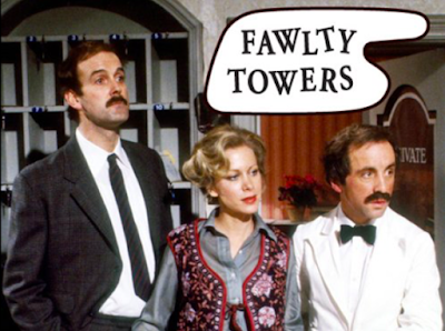
Fig. 1 Fawlty Towers logo (1975)
The style of their names also reflects their personalities. I was inspired by the logo for Fawlty Towers (see fig. 1) to make the letters in Adelaide's name look as if they are going to fall over, since Adelaide has not got her life sorted out, and relies on Jackie, who's name is upright since her life seems much more ordered.Colours

When branding a TV show, it is better to start with the content of the show and then create the brand to match this (Royal Television Society, 2016). Therefore, when choosing colours, I picked ones which were bright and could stand out, similar to those used in other Netflix sitcom logos aimed at young girls and women - Alexa & Katie and Unbreakable Kimmy Schmidt (see fig. 2).

Fig. 2 Netflix sitcom logos (2018)
However, these colours also have deeper meanings within the show:
- Blue for stability - this is what Jackie and Adelaide find in each other
- Pink for love - this is how Jackie and Adelaide feel about their dreams
- Purple for ambition - this is what drives the two women
- White for innocence - they are both still young and still learning.
Title sequence

Fig. 3 YouTube: 'Will&Grace' - All the intros [Season 1 - 9] (2017)
Title sequences can help set the tone for the show, and tease the fictional world it is set in, making them 'essentially a movie inside of a movie' (McGregor, 2016). Therefore, for the title sequence of this show, I aimed to give the audience an introduction to each character, since they are the main element of the show. Moreover, I also wanted to introduce the main focus of the show, which is that both women have careers, or wish to have careers, which mean a lot to them.
For this reason, this sequence would start with Jackie patrolling as a police officer, cut to Adelaide writing in the apartment, and show both women sitting together in the apartment - similar to the Will & Grace title sequence for season 8 (see fig. 3) - to show not only that they live together, but are also there to support each other.
Music
There would be music over the titles, as music that matches the images can help create the mood of the show, portraying to the viewers the show's themes and tone straight away (Harrisson, 2016).
This is why I chose Making Our Dreams Come True, which was the theme song to the sitcom, Laverne & Shirley, since it is positive and motivational, and emphasises the overall theme of working towards dreams.
However, there would be no music over the scenes, only in the titles, since this makes it feel less edited and more live.
Style/Tone

The energy would be emphasised by the show's light-hearted, comedic tone, highlighting positivity, a sense of community, and female empowerment.
This is because my main aim when creating this sitcom was to update classic feminist sitcoms - such as The Golden Girls, Laverne & Shirley, and The Mary Tyler Moore Show - but twisting it by using the tension of Jackie and Adelaide being opposites to show two modern women who are intelligent, ambitious, and independent, yet also co-dependent, and human enough to make mistakes.
List of illustrations
Figure 1. Fawlty Towers logo (1975) [Poster] At: https://www.imdb.com/title/tt0072500/?ref_=ttmi_tt (Accessed on 26 January 2019)
Figure 2. Netflix sitcom logos (2018) [Posters] At: https://www.netflix.com/browse (Accessed on 24 January 2019)
Figure 2. Netflix sitcom logos (2018) [Posters] At: https://www.netflix.com/browse (Accessed on 24 January 2019)
Figure 3. 'Will&Grace' - All the intros [Season 1 - 9] (2017) [YouTube webpage] At: https://www.youtube.com/watch?v=VIKDhYhRExU&t=0s&list=PLc9QYgv46S0P0GT-yulYqPGG6aVlr7Auo&index=3 (Accessed on 24 January 2019)
References
Bryant, K. (2015) '11 Secrets of a TV Costume Designer.' In: Mental Floss [online] At: http://mentalfloss.com/article/62434/11-secrets-tv-costume-designer (Accessed on 24 January 2019)
Harrisson, J. (2016) '15 great modern TV title sequences that sum up a show's theme.' In: Den of Geek. [online] At: https://www.denofgeek.com/uk/tv/game-of-thrones/23991/15-great-modern-tv-titles-that-sum-up-a-shows-theme (Accessed on 24 January 2019)
Harrisson, J. (2016) '15 great modern TV title sequences that sum up a show's theme.' In: Den of Geek. [online] At: https://www.denofgeek.com/uk/tv/game-of-thrones/23991/15-great-modern-tv-titles-that-sum-up-a-shows-theme (Accessed on 24 January 2019)
McGregor, L. (2016) 'Title Sequences - The Theory Behind Them and How To Make Your Own.' In: Indie Tips. [online] At: http://www.indietips.com/title-sequences-the-theory-behind-them-and-how-to-make-your-own/ (Accessed on 24 January 2019)
Royal Television Society (2016) Viceland: the importance of branding. At: https://rts.org.uk/article/viceland-importance-branding (Accessed on 24 January 2019)
Salinas, J. (2010) The Importance of Branding in Television. At: https://www.txstatemcweek.com/the-importance-of-branding-in-television/ (Accessed on 24 January 2019)
Wheeler, N. (2017) 'Studio and Set Design Basics.' In: business.com [online] At: https://www.business.com/articles/studio-and-set-design-basics/ (Accessed on 23 January 2019)
Comments
Post a Comment